TREND FORECAST • DESTINATION DESERT
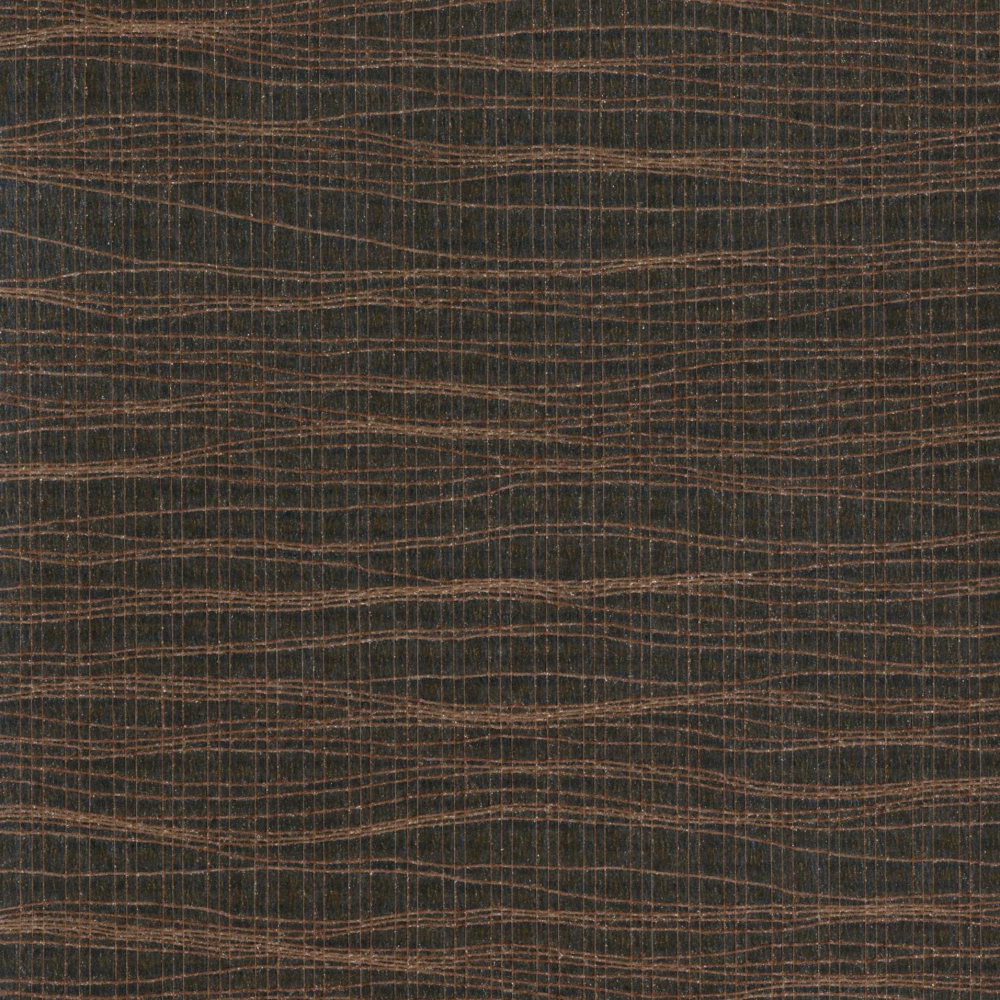
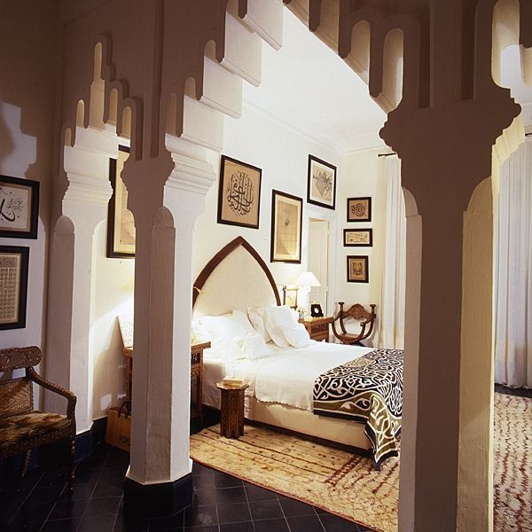
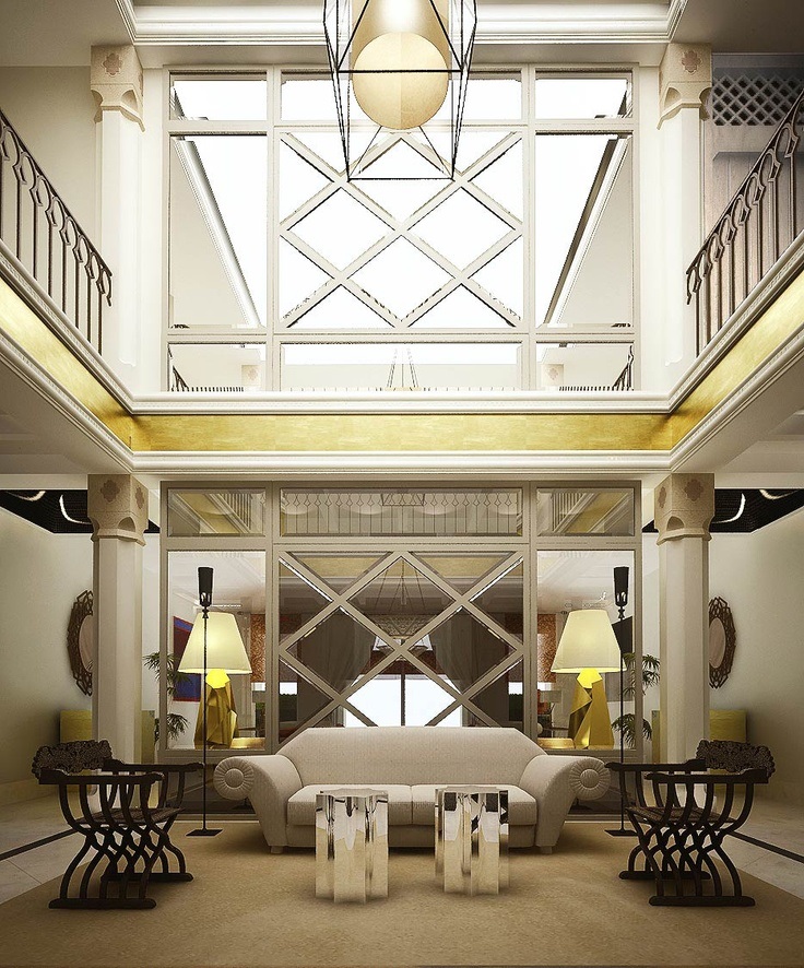
The desert has emerged as the style inspiration of a generation drawn by minimalism, spirituality and the eclecticism of unfettered personal choice. Check out these new York Wallcoverings to make your own desert oasis.
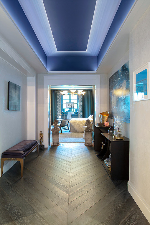
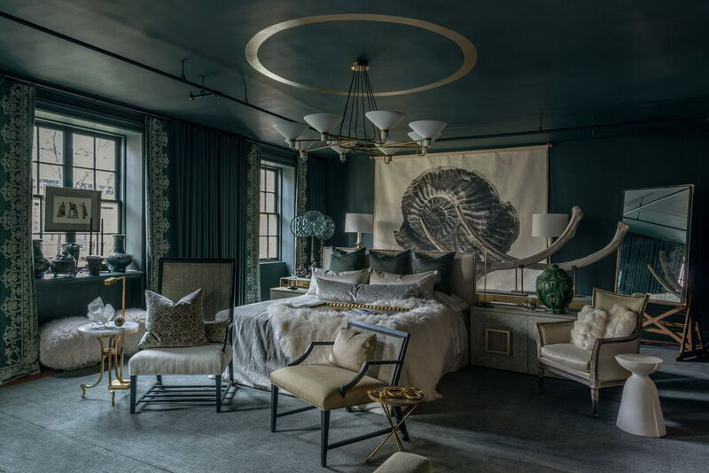
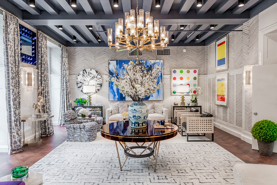
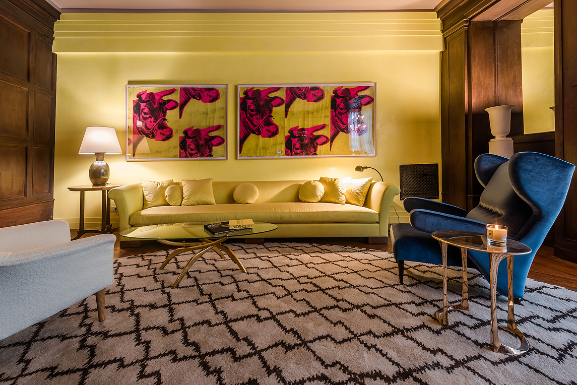
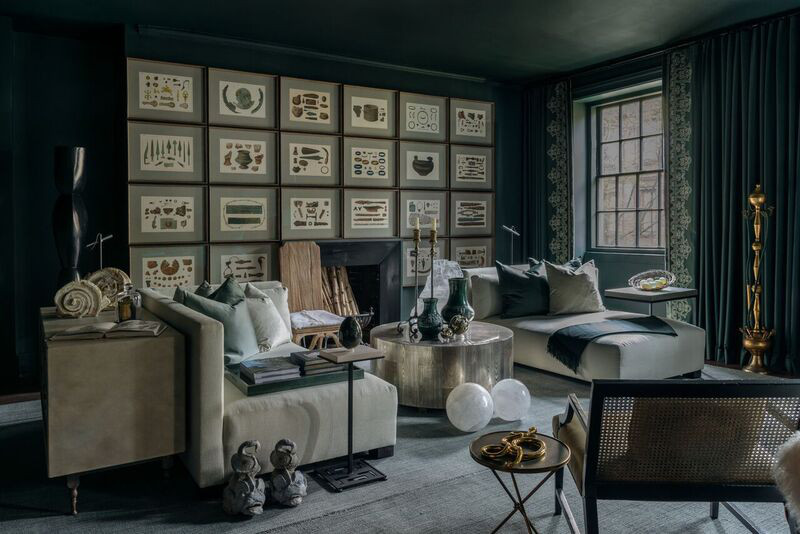
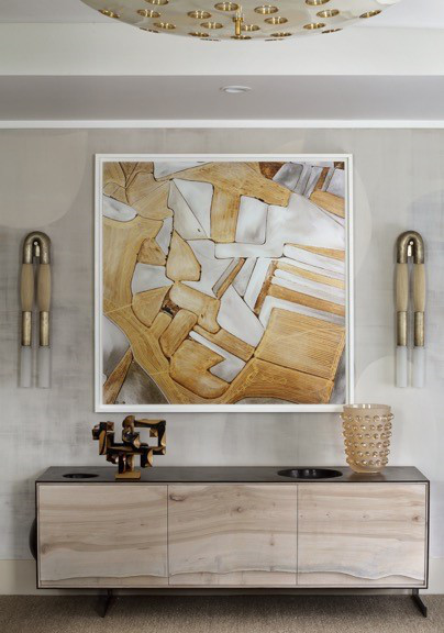
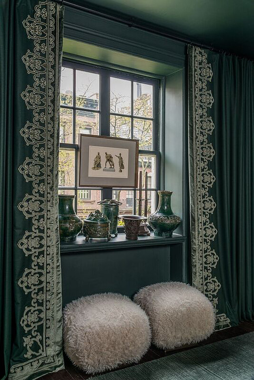
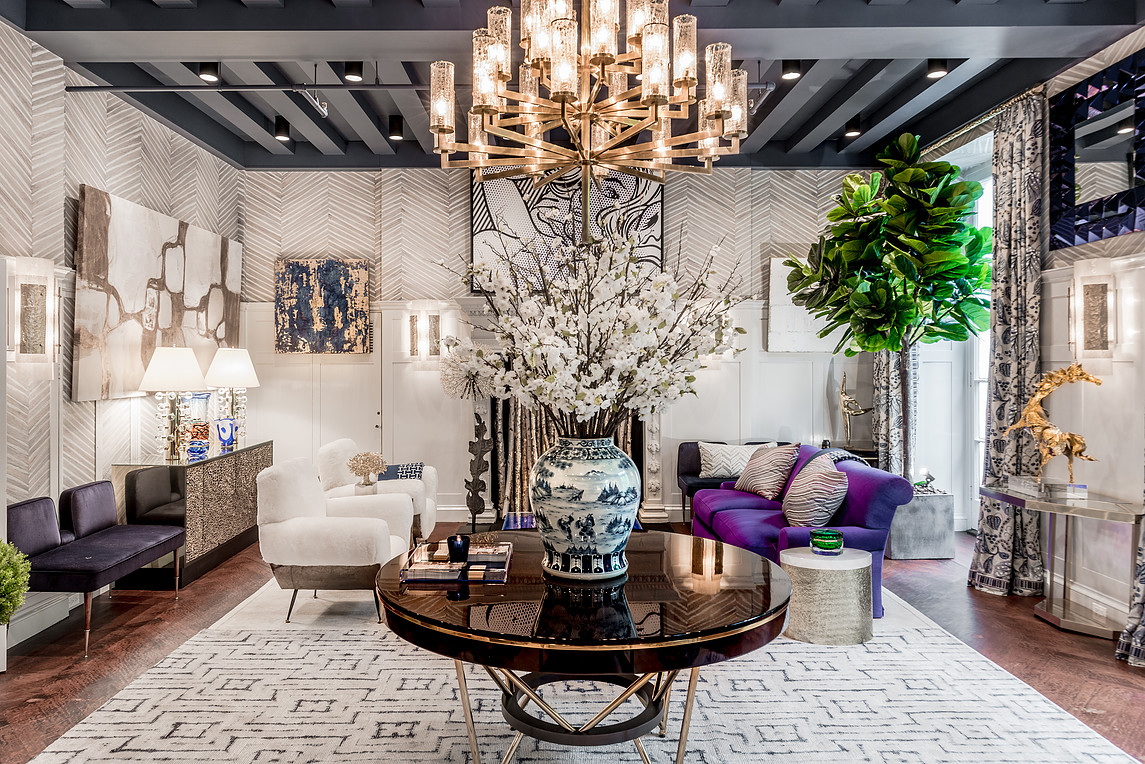
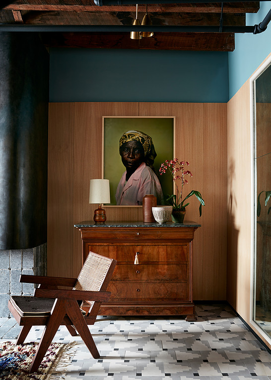
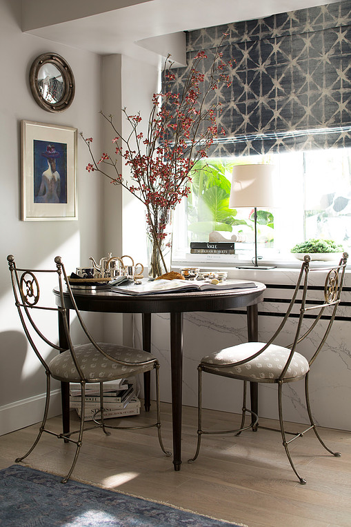
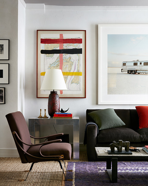
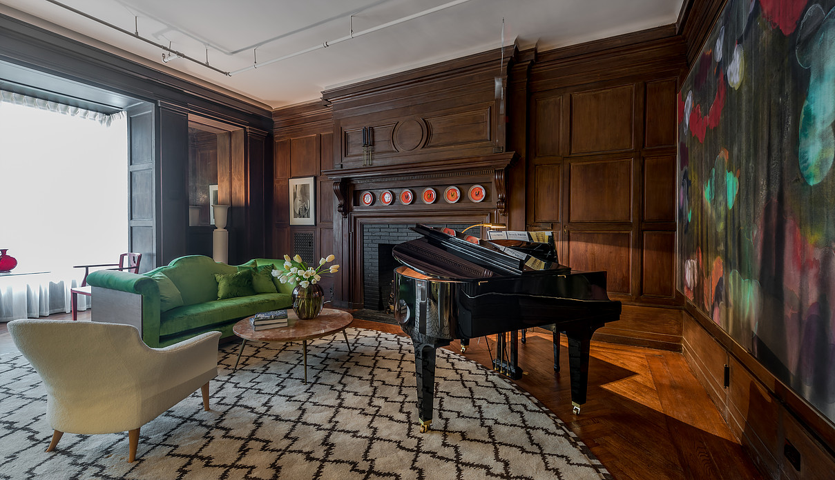
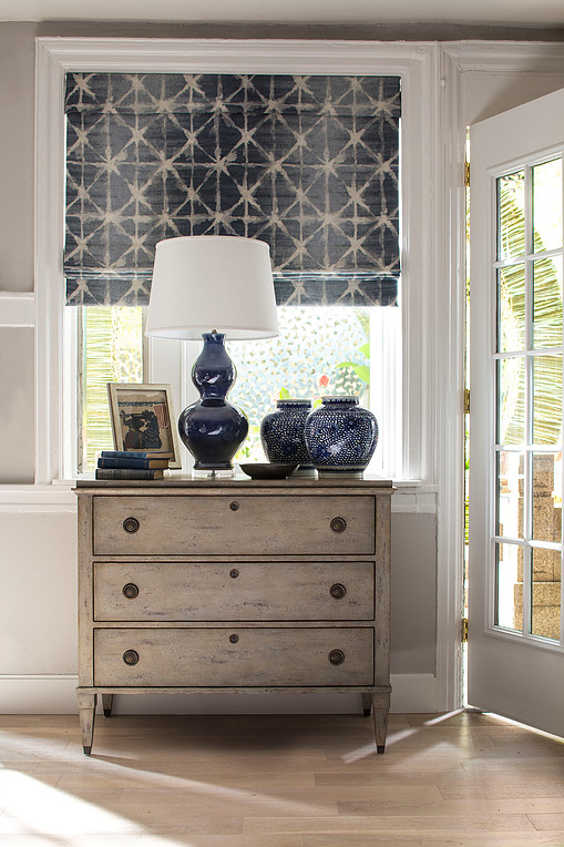
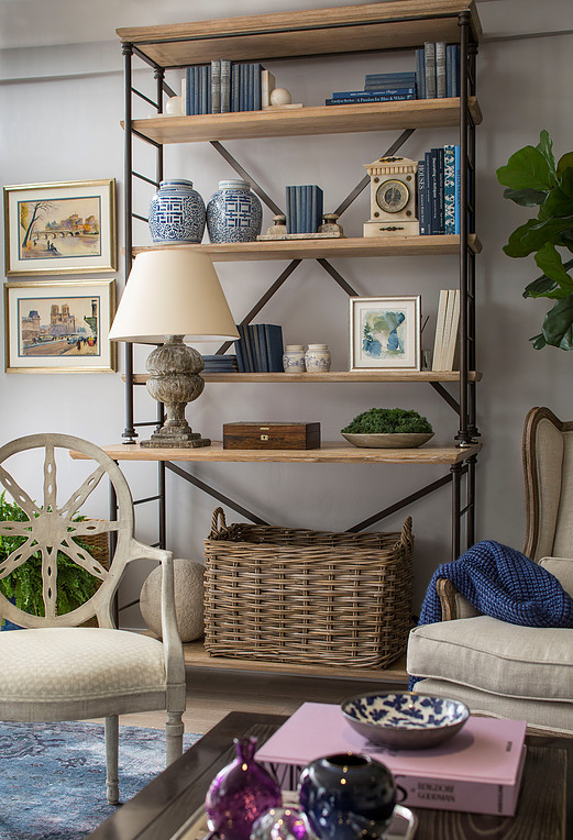
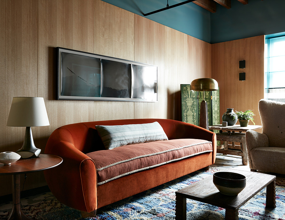
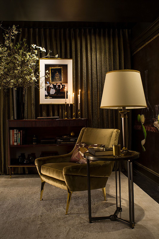
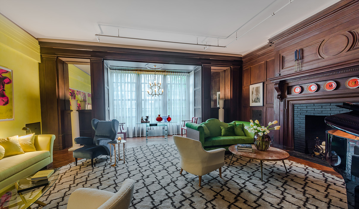
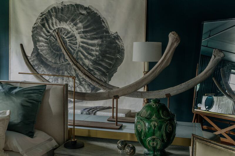
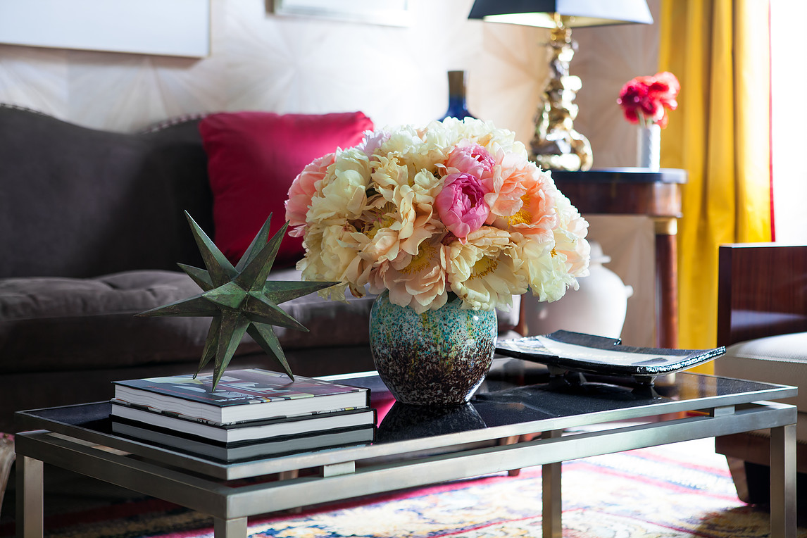
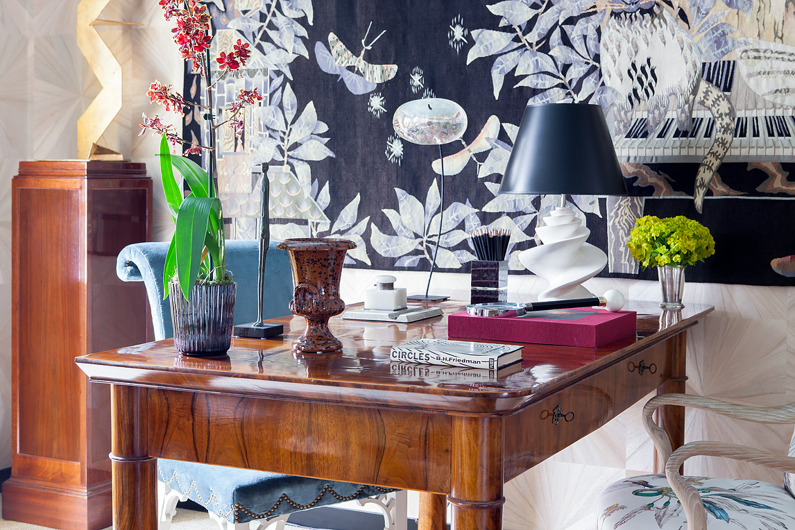
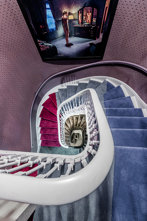
THE 45th ANNUAL KIPS BAY DECORATOR SHOW HOUSE
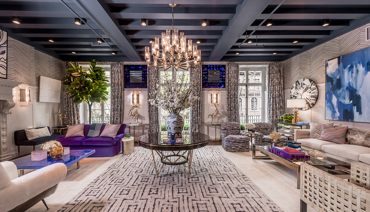
Each year, celebrated interior designers transform a luxury Manhattan home into an elegant exhibition of fine furnishings, art and technology. This all began in 1973 when several dedicated supporters of the Kips Bay Boys & Girls Club launched the Kips Bay Decorator Show House to raise critical funds for much needed after school and enrichment programs for New York City children. Over the course of four decades, this project has grown into a must-see event for thousands of design enthusiasts and is renowned for sparking interior design trends throughout the world.
125 EAST 65TH STREET – HISTORY OF THE HOUSE
The Upper East Side is known for its grandiose townhomes and stately buildings. Lenox Hill, the neighborhood that stretches from East 60th Street to 77th Street, is no exception to this rule and serves as a true testament to the stunning architecture of New York’s Upper East Side. Given the current scenery of the Upper East Side, however, one may find it difficult to believe that the neighborhood was not always home to the exquisite buildings that exist today.
Until the second half of the 19th century, the Upper East Side was owned by the City of New York and was entirely forest or farmland, essentially untouched due to the lack of streets above what is now midtown. Due to the expansion of streetcars and carriages, uptown became far more accessible and alluring. This combined with a real estate bubble that had land prices increasing as much as 200% allowed for a construction boom in the Upper East Side, with investors commissioning rows of townhouses to be occupied by businessmen and merchants. The popular style at the time was the brownstone, featuring three to four stories with a raised parlor and a tall front stoop, which still line the streets of the Upper East Side today.
During this period of growth in the latter half of the 19th century and stretching into the early 20th century, architect Charles A. Platt’s firm emerged at the forefront of the American architecture scene. His Georgian style mansions and country houses are widely regarded as the finest American examples of their genre. To this day, historians and architects alike consider Platt’s work to be some of the most influential of 20th century design. Prior to entering into the architecture sphere, Platt was a successful landscape designer. Using this experience, Platt heavily emphasized the amalgamation of interior and exterior spaces, which is highly evident in his projects. He is most recognized for designing the Freer Gallery in Washington, D.C., Maxwell Court in Rockville, Connecticut, the Park Avenue Armory in New York, and Villa Turicum in Lake Forest, Illinois. Throughout his career, Platt remained a fixture in popular design magazines, which often highlighted his unique aesthetic and keen ability to bring nature into urban settings.
Between 1930-1935, East 65th Street underwent complete redevelopment to become largely what it looks like today. In 1905, Platt was commissioned to build 125 East 65th Street, which, flash-forward over 110 years would become the site of the 2017 Kips Bay Decorator Show House. Interestingly, the townhouse has housed only two occupants since it was built over 100 years ago.
The neo-Georgian townhouse was originally built for the American physiologist, Frederic S. Lee (1859-1939), who fulfilled his research career at Columbia University’s College of Physicians and Surgeons. It is most notably recognized, however, for being the headquarters of the China Institute, which moved into the space on December 1, 1944 as a result of magazine magnate Henry R. Luce’s substantial contribution. Henry R. Luce generously gifted “China House” in memory of his father, who had been a missionary and educator in China until his death in 1941. George Nelson, editor of Architectural Forum magazine, was charged with designing the floor plan, implementing a 424-square-foot art gallery in the ground-floor front room.
The China Institute remained headquartered at 125 East 65th Street until 2015, when it relocated. Up until 1966, the house hosted Chinese art exhibitions for special occasions. In 1966, the ‘China House Gallery,’ which would be renamed the ‘China Institute Gallery’ in 1994, came to exist due to a grant from investment banker and Chinese art collector, Myron S. Falk Jr., who acted as the first chairman of The China Institute. He, along with co-chairs Mrs. Edwin F. Stanton and Mrs.Edward M. Pfluenger, made the exhibitions a permanent feature, beginning with ‘Selections of Chinese Art: From Private Collections in the Metropolitan Area,’ which opened on November 15, 1966. It is they who made China House what it would come to be known as up until The China Institute’s relocation almost two years ago.
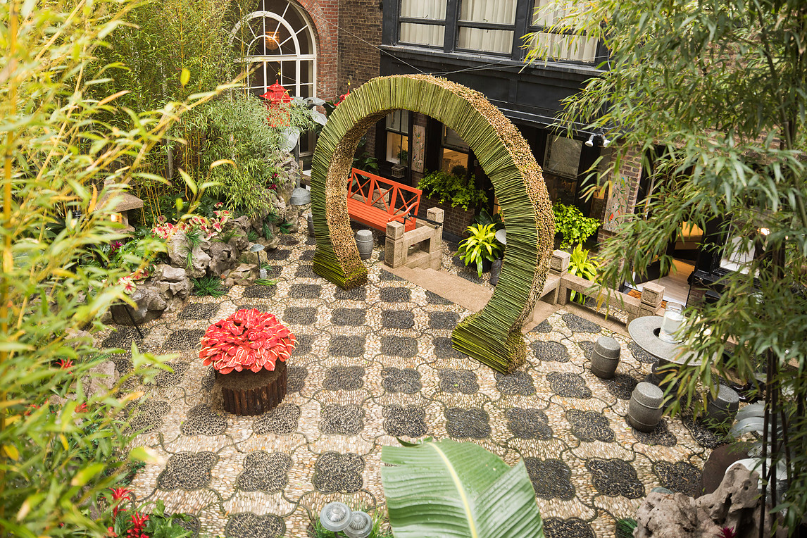
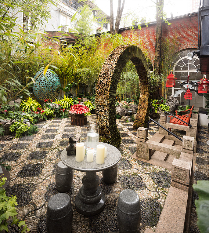
There are many remarkable features of the townhouse, perhaps that most extraordinary being its 35-foot width, making it 10 to 15 feet wider than the majority of townhouses. The ceilings are also exceptionally high, reaching 12 feet in the living room. These elements, combined with the double-width staircase, make the space truly unique and grandeur. The house still holds onto some of its past as ‘China House,’ with the outdoor courtyard still intact. 125 East 65th Street’s rich history truly shines and will give residents a chance to live in one of New York’s most prestigious neighborhoods in a home built by one of America’s most notable architects.
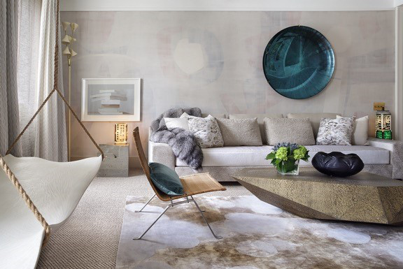
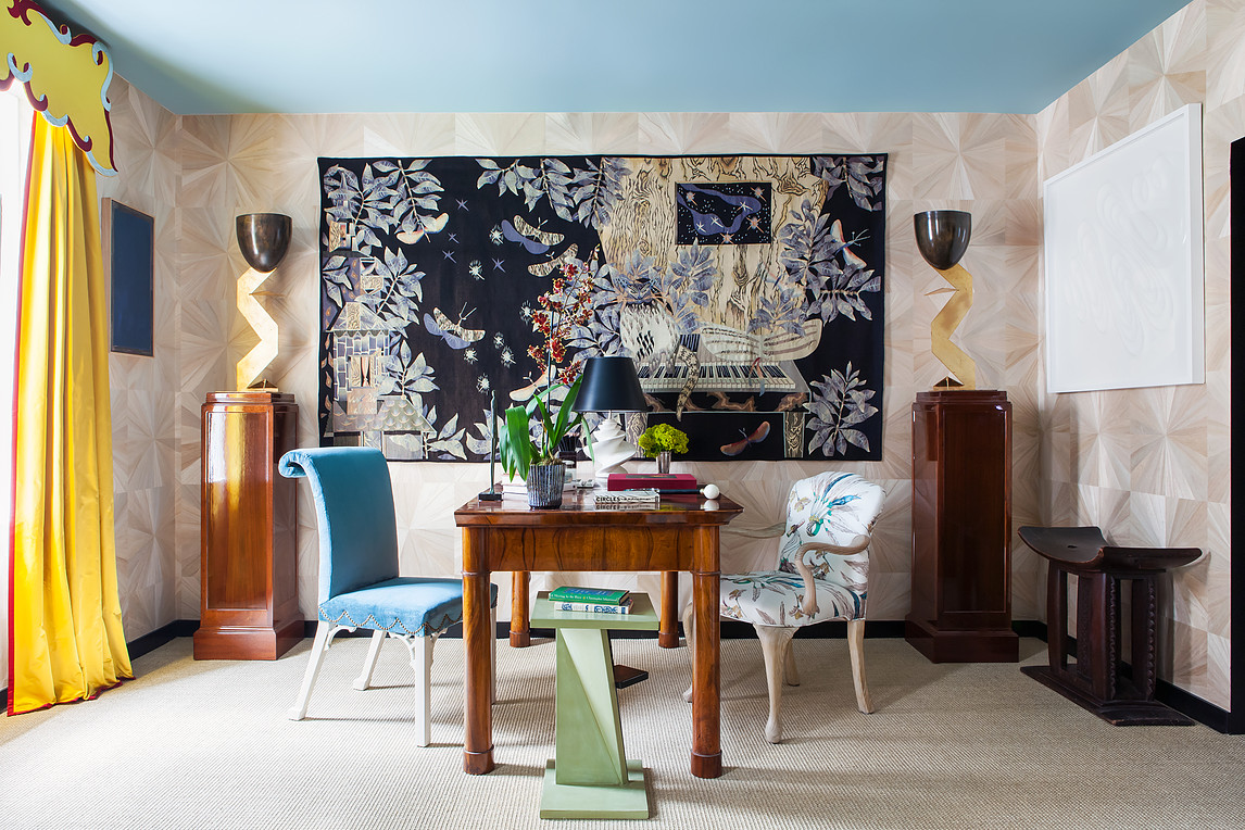
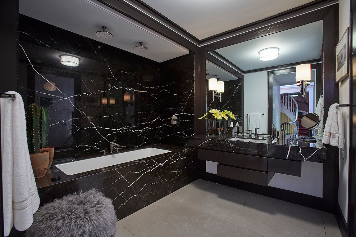
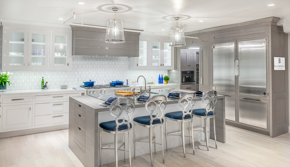
ART IMITATES LIFE...'THE HOLIDAY'
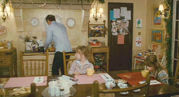
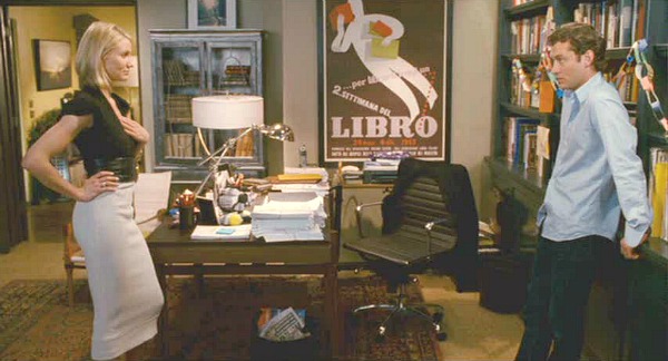
One of our favorite movies that showcase a variety of interiors is ‘The Holiday’ a story about two women swapping houses for a much needed vacation from their respective lives.
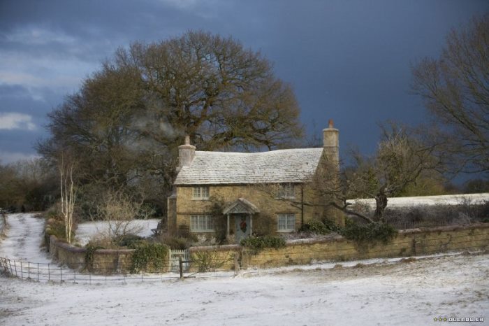
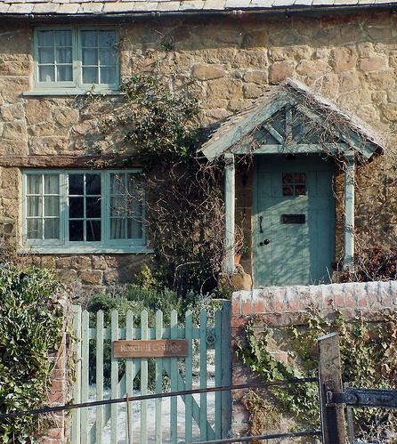
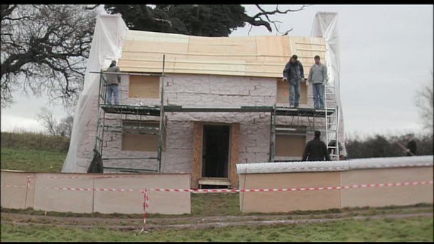
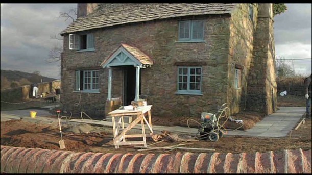
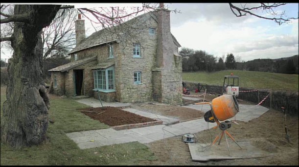
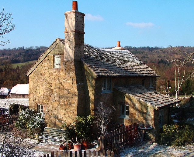
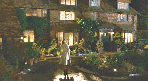
From England, Iris’s home is a charming country cottage in a small village. As it turns out, the cottage wasn’t real – its fake exterior was built in 2 weeks in the middle of a field. The crew created everything in the movie, including the landscaping and stone wall. As the film takes place around Christmas time, fake snow was added to the scene.

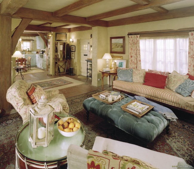
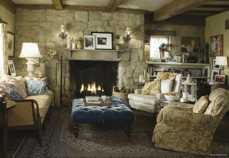
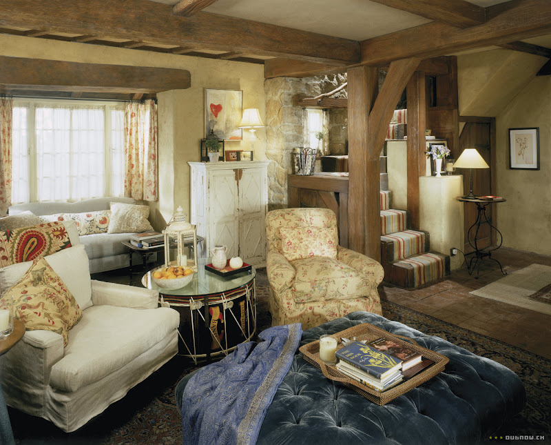
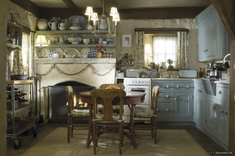
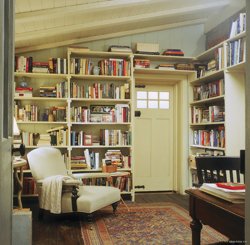
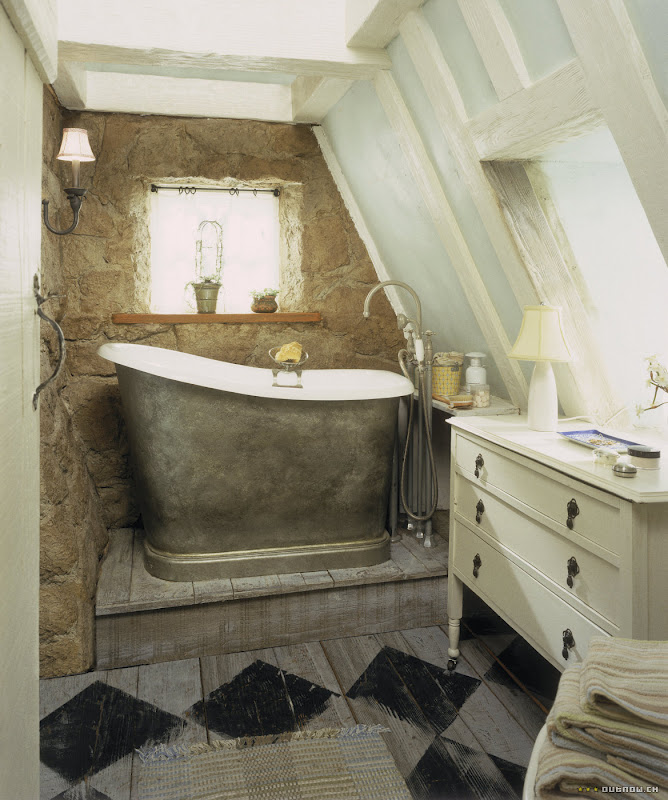


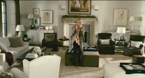
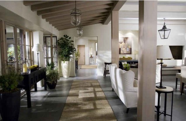
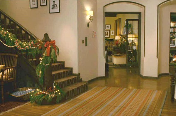
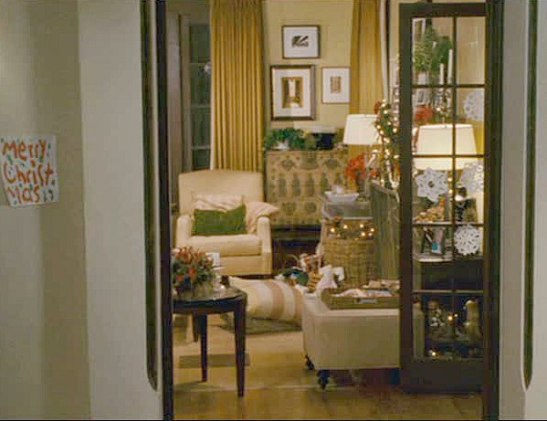
Iris swaps her house with Amanda in California – getting what seems like the better deal between the two! It’s an extraordinary contemporary home that, in this case, is real, and is located in Pasadena and built by architect Wallace Neff.
The interiors were actually very expensive sets built on a sound stage. When the film opened in 2006 it forecasted many trends that are still in vogue today – gray and taupe color scheme, natural rugs, crisp white upholstery, and oversized lantern styled light fixtures.
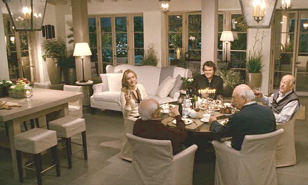
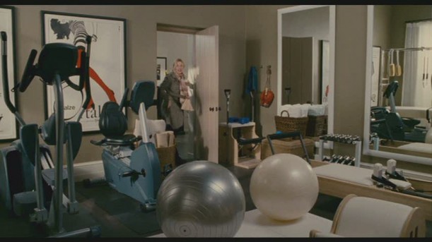
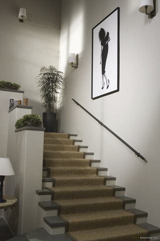
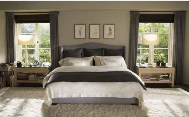
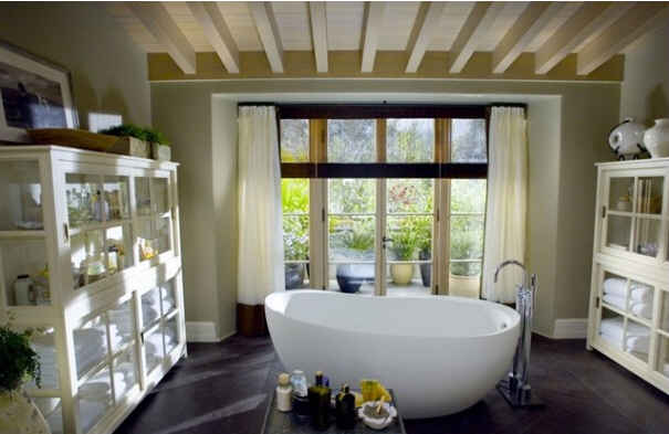
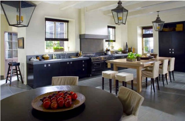
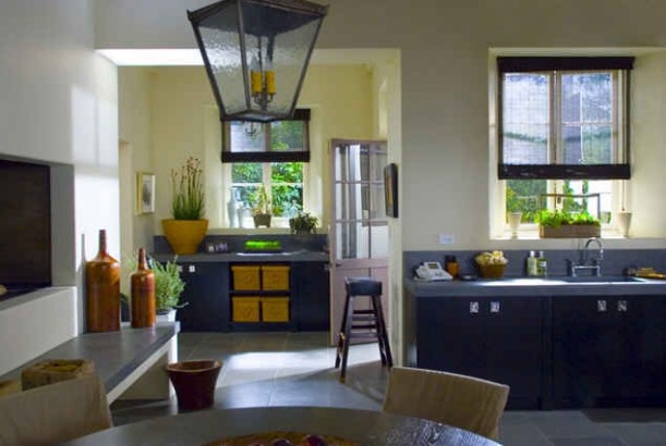
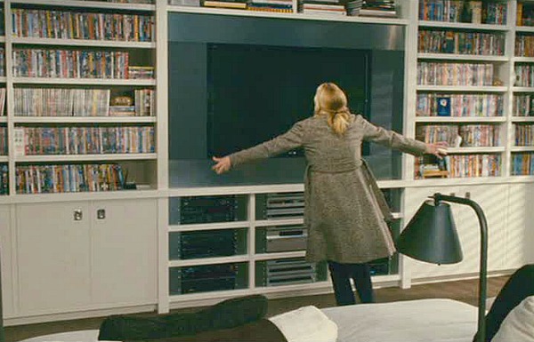
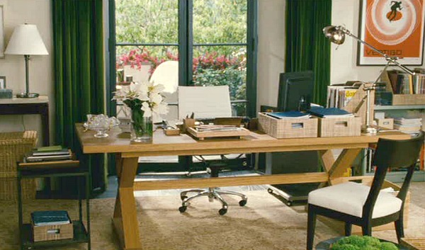
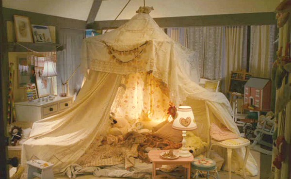
Finally, Amanda meets Iris’s brother, Graham and pays a visit to his home called Mill House, the most memorable room being his daughter’s charming bedroom.


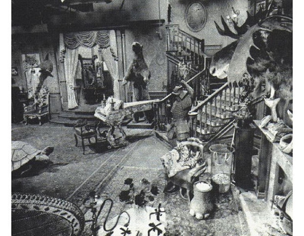
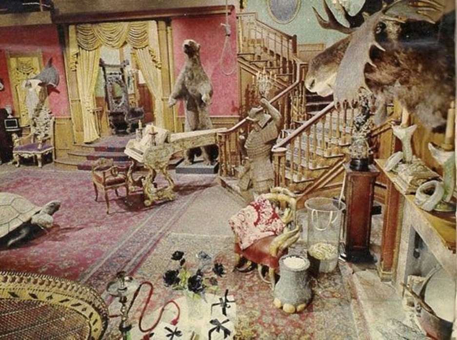
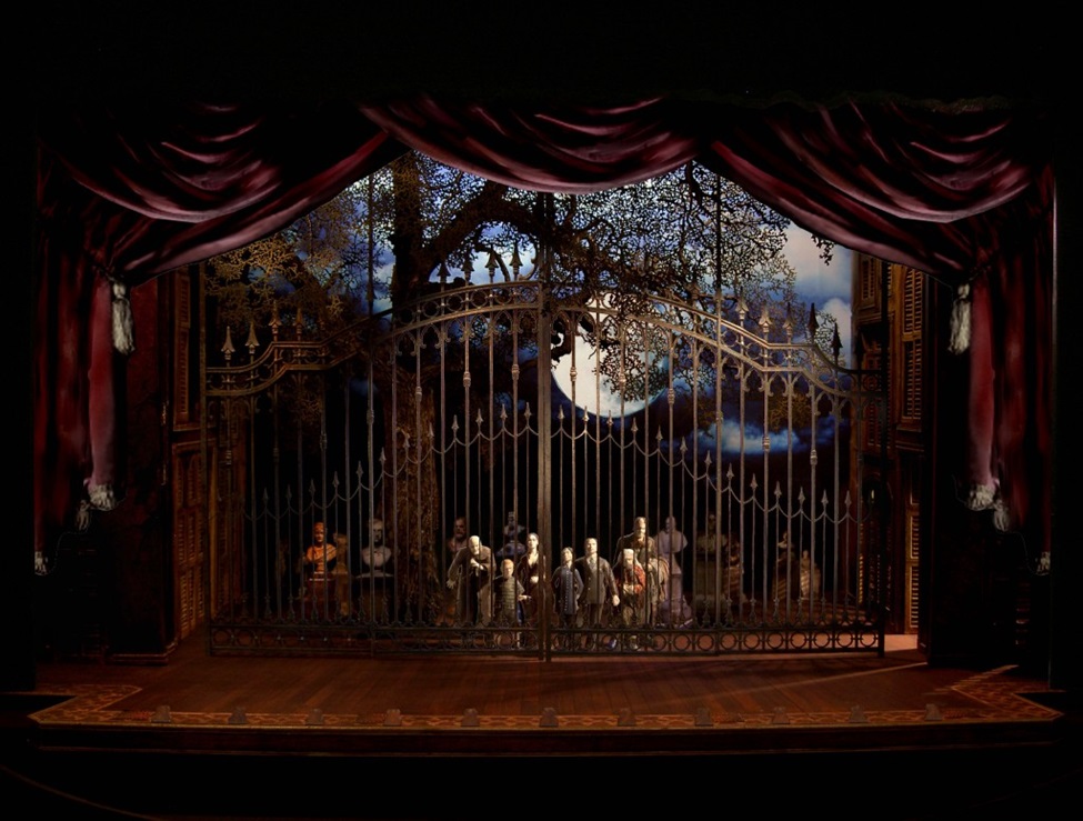
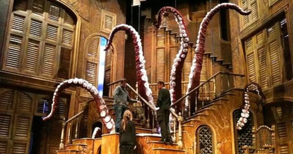
ART IMITATES LIFE...'THE ADDAMS FAMILY'
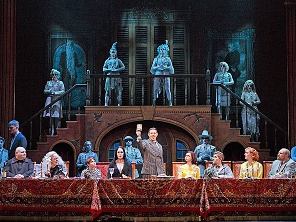
The Addams Family mansion has had several incarnations over the years. It begins with the Charles Addams cartoon depicting it as a dilapidated mansion that had been condemned.
From 1964 to 1966 the original Addams Family series ran on ABC television. Known for their macabre style, both in their personal wardrobe and their home’s interior, it is surprising to learn the actual room setting was a colorful blend of bright tones of pink and mint green!!
In 1991 the first of two films were made, resurrecting the mansion’s original exterior from the Charles Addams cartoons. The interior contains somewhere between 25 and 30 rooms, including Uncle Fester’s lab, dungeons, a vault, and a conservatory.
Even though the films were shot in color, somber palettes and dim lighting still created the creepy atmosphere.
In 2009, the Addams Family became a Broadway musical, and the set design carries on the haunted interior theme.
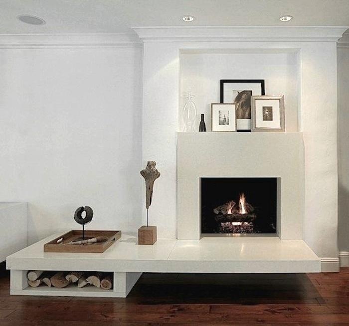
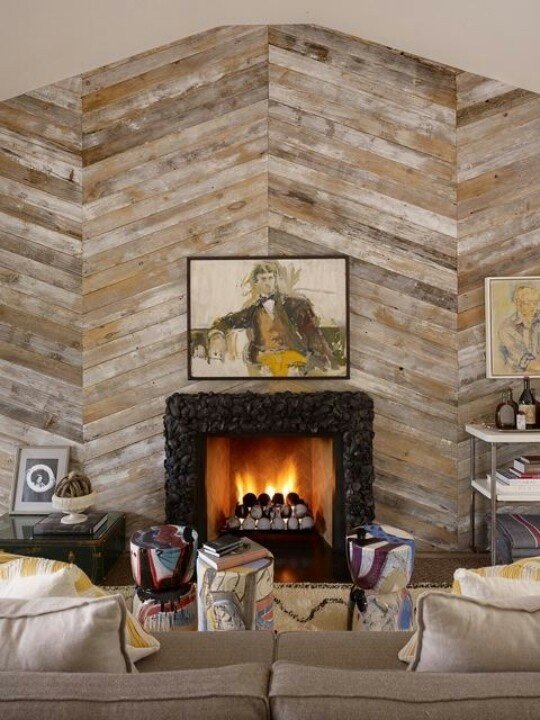
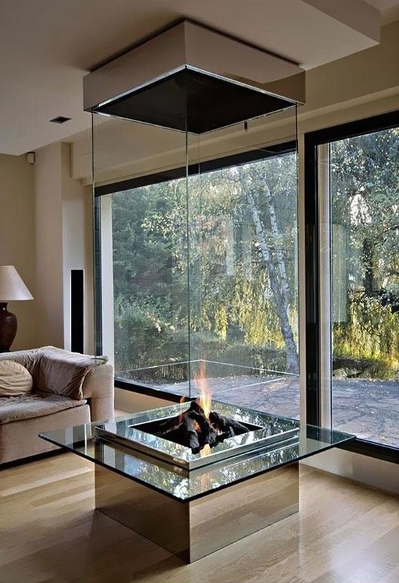
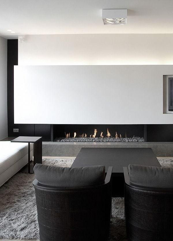
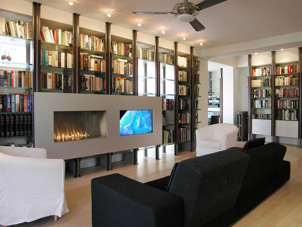
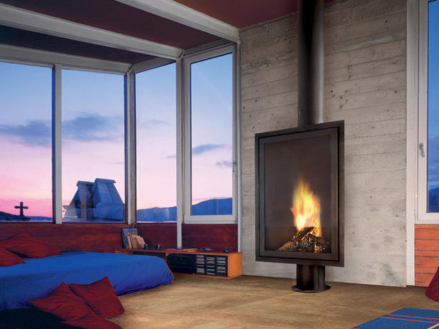
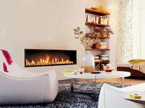
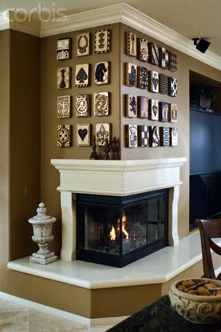
HOT STUFF!!
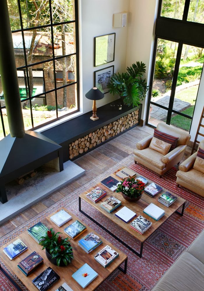
20 fireplaces we could really warm up to....




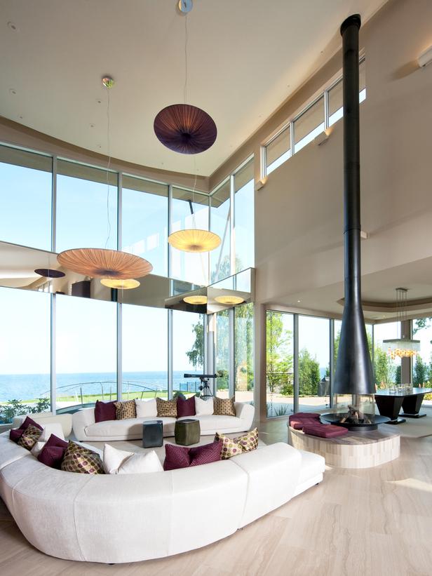
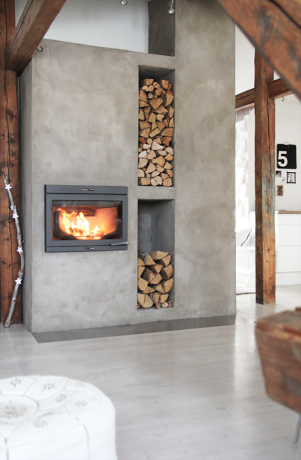
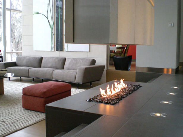
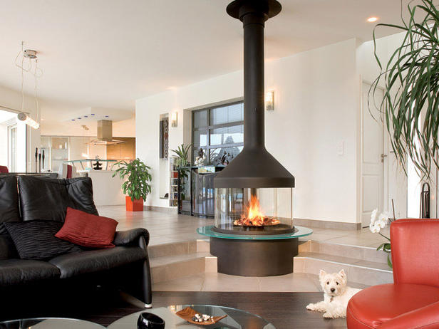

GLOBAL DECOR - GREECE
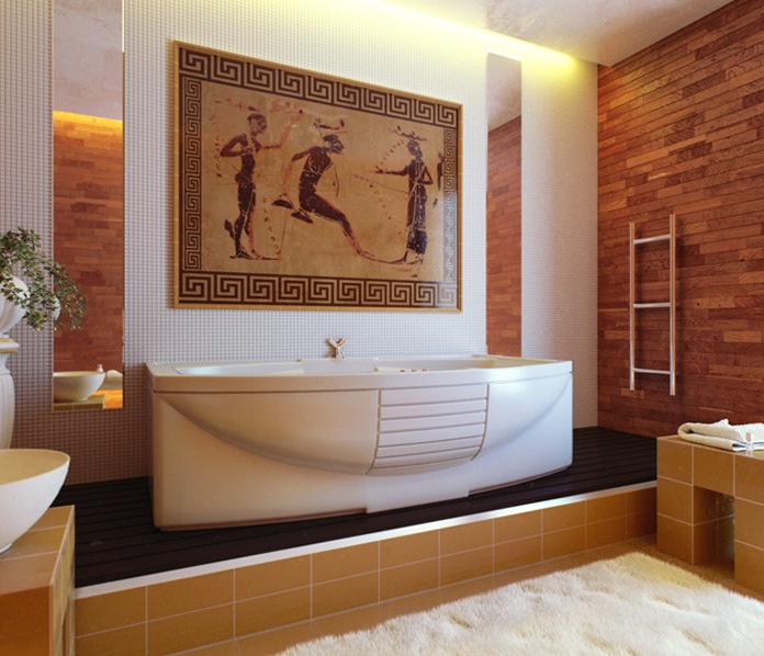
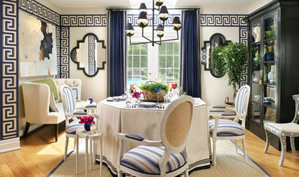
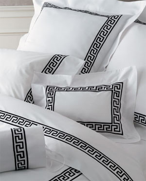
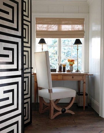
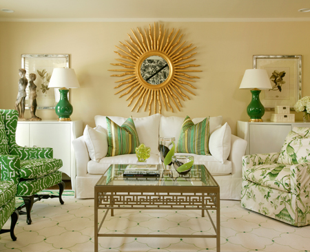
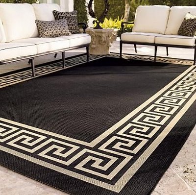
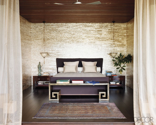
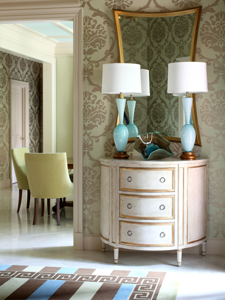
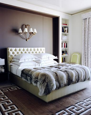
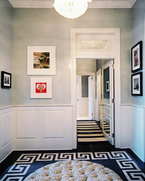
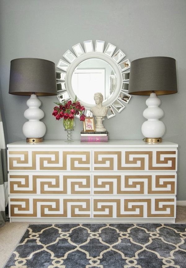
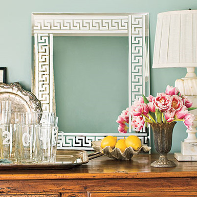
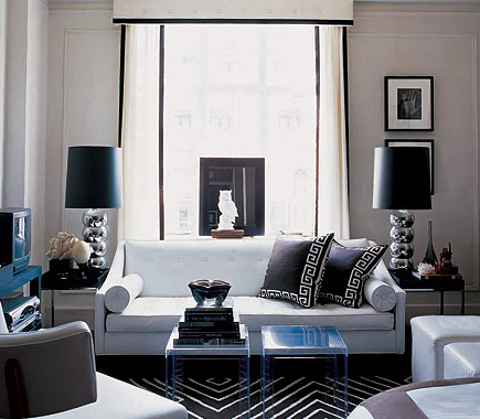
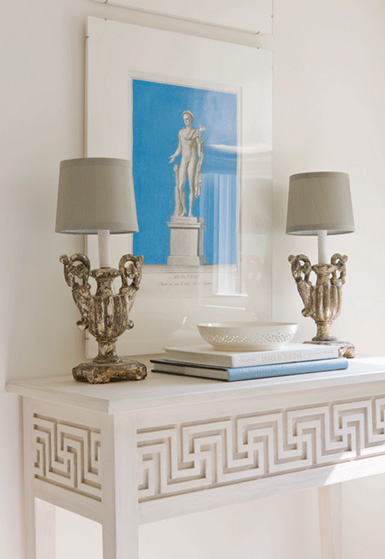
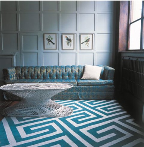
The Greek Key design has its origins in ancient Greece and is their most important symbol. During the medieval period, the key form was used in many ancient Greek temples, primarily due to their interest in labyrinths.
This motif is also called Meandros or the Hellenic Key, after the Meander River which was twisty and doubled onto itself, giving a symbolic meaning to the key of the eternal flow of life.
The graphic Greek Key design can be used in both modern and classical interiors. There are numerous products which incorporate this timeless design…you will find it embellishing furniture, rugs, lamps, mirrors, and fabrics.


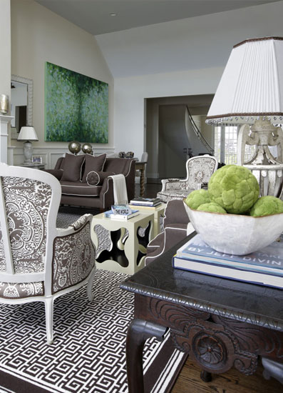
FUTURE PAST - ANCIENT GREEK STYLE
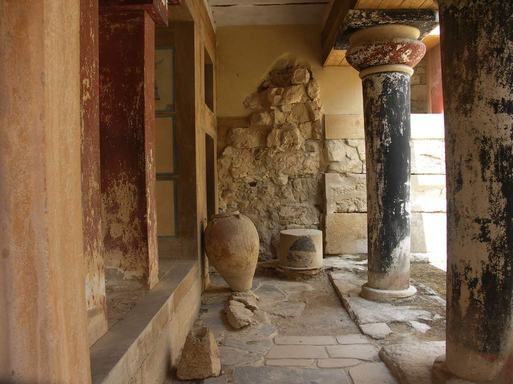
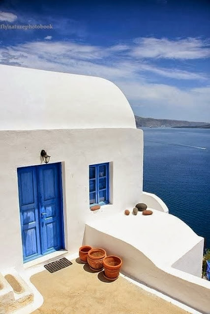
Unlike today’s temporary contemporary construction, homes in Ancient Greece were built to last - in fact, some are still occupied to this day. Stone building materials were used on both palaces and whitewashed cliff dwellings. Regardless of the home’s size, interior design in Ancient Greece centered around the family’s hearth. Even back then, the open concept was popular!
When crafting furniture, artisans followed Egyptian design lines, and the materials used did not differ much either from those used by Egyptians. Greek carpenters added ornamentation to furniture with copper, bronze, and iron embellishments, and wood veneer trim.
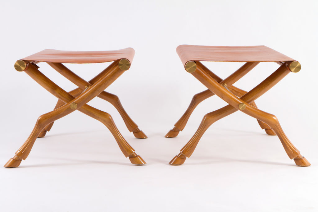
The backless stool was the most common form of Greek seating. Easily portable, they also were created in a folding variety, with plain straight or curved legs that typically ended in animal feet. Couches were also used in Greece as early as the late seventh century. These were rectangular in shape and supported on four legs, two of which were longer than the other, creating support for an armrest or headboard.
Homes were not cluttered with excessive furniture, and what there was were simply designed and utilitarian, although beautifully made. Persian design had strong influences on Greek interiors – those who could afford it used colorful Persian tapestries and rugs to adorn their walls.
To mimic this style in your home try these Grecian formulas:
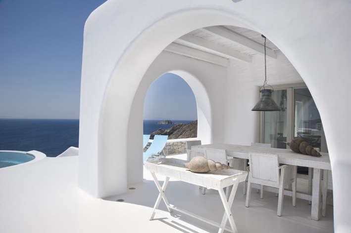
1. Bright, whitewashed stucco walls with gently rounded arches, wood paneled beam ceilings, and bright blue shutters and doors
2. Mosaic tile in Greek motifs on bathroom walls, floors, and shower stalls
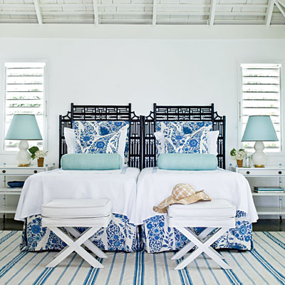
3. Crisp white bed linens with a Greek key border
4. Backless stools as seating around a simple wood slab dining table
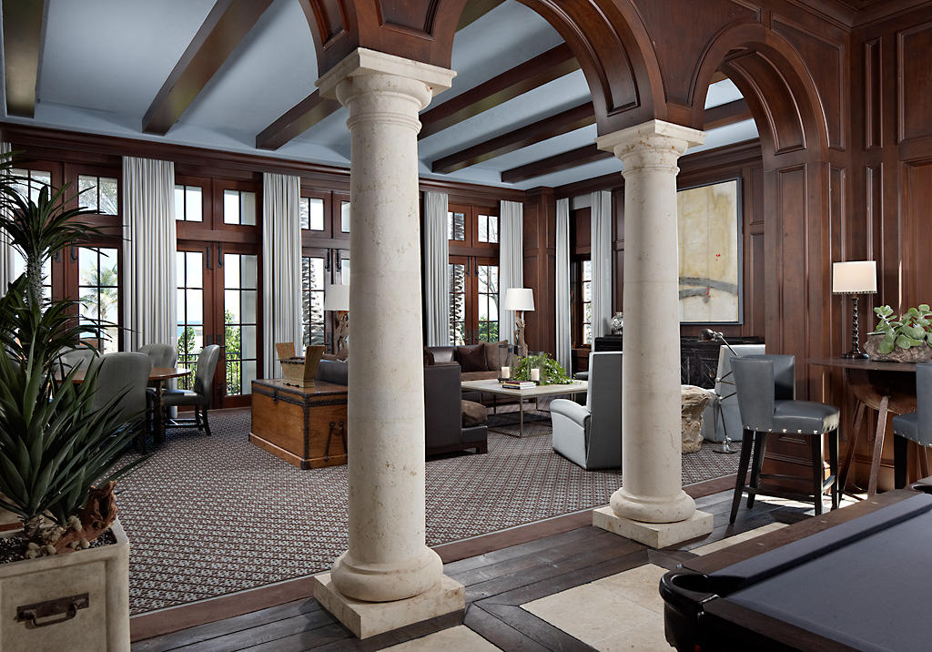
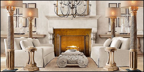
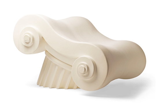
5. Scour architectural salvage companies for sculpted Doric or Corinthian columns, or find reproductions made of plaster or lightweight material
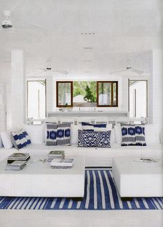
6. Low white sofas combined with simple wood tables
7. Chairs with woven rush seats
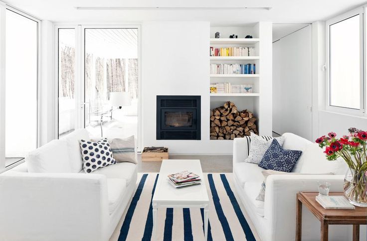
8. Blue and white striped area rug
9. Add a reproduction Greek amphora or two to complete your style
OUTDOOR FURNITURE BUYING GUIDE
Make the most of your outdoor space with furniture that complements your favorite open-air activities. Consider these things before buying your outdoor furniture:
- Is the furniture appropriately scaled to the outdoor area where it will be used? A small patio or deck can be dwarfed by large furniture groupings. Conversely, a spacious deck looks best with a larger grouping.
- Will the furniture seat the required number of people? Consider who will typically use the furniture. If you plan on entertaining large groups, stackable metal or resin chairs store in a small space, ready for that garden party or family reunion.
- Do the styles and colors of the furniture blend with your home? Treat your deck or patio as you would any other room in your home when decorating. Outdoor furniture is available in many styles from rustic to modern. Choose from cushions with colors as vivid or subdued as you like.
There are four main types of furniture to consider: wood, metal, wicker, and recycled plastic. This guide describes the advantages of each and what to look for.
WOOD
Everything from simple pine to luxurious teak is used to manufacture wood patio furniture. Dissimilar types of wood perform very differently and you should always take this into consideration if you are contemplating the purchase of wood patio furniture. Softer woods (those products harvested from needle-bearing trees) are going to weather quickly and will require annual maintenance. Harder wood (those harvested from broad leaf trees) will last longer and not require as much attention.
If your wood patio furniture will be in a sun room or covered area, this isn’t an issue. Soft woods such as pine, cypress, and redwood will be fine. However, if you plan to use your wooden furniture where it will be exposed to the elements, you should shop for a hardwood. These are traditionally Brazilian Cherry, Jarrah, and Teak.
Teak furniture tends to be the most expensive to purchase, however it may be worth the extra dollars. Teak is one of the hardest woods available, which means it is impervious to insect damage. It won’t rot or splinter, and it requires no special treatment if it is going to be exposed to rain and sun. New teak has a rich, buttery honey colour and will maintain this look if you simply apply linseed oil to it once or twice a year. If left alone, teak will weather to a silvery grey finish.
METAL
Metals commonly used for outdoor furniture are aluminum, iron, and steel. Wrought iron and steel furniture are basically the same; wrought iron is a low carbon form of steel. Both tend to be budget-friendly, though high end, designer wrought iron furniture is also available. As both types take abuse very well, they should survive heavy usage. This furniture is weighty and perfect for windy locations.
Modern manufacturing techniques include a zinc wash to inhibit the formation of rust, eliminating concern and objection to this material. If rust does occur, you can simply sand and spray paint the affected area and it will be as good as new. Slight rusting does not compromise the integrity of the frames.
Cast aluminum furniture is made by pouring molten aluminum into molds of different shapes that are then assembled to create the furniture, resulting in a beautiful, heavy, weather-resistant product. Cast aluminum is very durable and requires very little maintenance, making it extremely popular for all budgets. It has no rust issues and being a heavy material it is perfect for areas where wind is a concern.
Extruded aluminum is generally combined with “sling” fabric to produce maintenance free, comfortable outdoor seating. Extrusion is the process of shaping material by forcing it through a die. The shapes are combined to created frames for chairs and tables, resulting in a lighter less cumbersome frame than cast aluminum that still maintains the weather resistant properties.
Cast aluminum and extruded aluminum elements can often be found in the same furniture
WICKER
Having undergone a revolution in the past several years, wicker and rattan furniture can be found in its traditional form, as well as the newer, popular synthetic option. Available in classic weaves and styles; it is also manufactured in a wide variety of modern weaves and styles, thus having the ability to be implemented into any décor.
Traditional wicker is usually rattan, but may be woven of other natural materials. Suitable for indoor or covered areas, it will weather and require some care if it is exposed to the elements. Synthetic wicker is impervious to weather and can be used in any location, requiring no special maintenance.
RECYCLED PLASTIC/POLYMER/RESIN
If “green” living is your goal, poly lumber is the perfect option for being eco-friendly. Manufactured from recycled plastics it is designed to mimic wood, and in fact, is cut and assembled the same way. As well as being eco-friendly, it is weather-friendly – treated with UV inhibitors so it will not splinter or rot. This material is heavy enough for high wind areas, and will last a very long time.
Resin or plastic furniture has many advantages which include low cost, ease of maintenance, and portability. Unfortunately this same portability factor will have you chasing your pieces across the yard during a storm.
Demand for stylish outdoor furniture has inspired new designer looks at affordable prices, in contemporary lines and bold colours, all at affordable prices.
OUTDOOR ROOM IDEAS
Whether you are designing a small or large outdoor space, there are several design elements to consider. Though you may not be able to utilize all of these elements, incorporating one or more can really boost the appeal of your outdoor design.
SEATING
By using a variety of seating options, you can create a flexible arrangement that can be moved according to the event. Extra chairs can be pulled up to a dining table, or scattered around a conversational area. Small stools are easily arranged, and like other outdoor furnishings they can be made from a choice of materials – upholstered, wood, metal, or even ceramic. Built-in seating can do double duty as a way to delineate space.
TRAFFIC PATTERNS
By combining hardscape materials with planted or potted shrubs and trees, you can create a flow through your space and delineate areas with intent – separating dining, relaxing, and fun zones. Paths curving through your outdoor space will add a sense of discovery. Explore the many options available for hardscaping for inspiration – decking, rocks, pavers, etc.
FIRE
If space and budget permit, an outdoor fireplace or fire pit can really make your yard sizzle. An added element of fire transforms the outdoors into a cozy and inviting space. Gathering around an outdoor fire source is great on a chilly evening, and makes the perfect place to toast marshmallows!!
FOCAL POINTS
Just like designing an indoor space, creating a focal point applies to outdoor rooms as well. Anchoring a well-placed arrangement of furniture around one element will provide a cohesive, inviting solution. Painting an exterior wall with an accent colour is a fun way to create a focal point. Add some ‘outdoor proof’ art or wall décor to further establish your focal point.
VISUAL FEATURES
Water features, sculptures, and flea market finds can be added to give your outdoor space visual appeal. For smaller yards or balconies, or to delineate a space, containers of all shapes and sizes can be planted with seasonal colours. Lightweight pots can be easily moved to make rearrangement less of a chore. Outdoor area rugs can be used to create different zones in your space.
PRACTICALITIES
Occasionally limited space makes it essential that furnishings do double duty. Benches and tables can have storage underneath, shelves and hooks can be installed on a wall to hang towels or garden tools. An outdoor kitchen can make repeated trips into the house unnecessary. Along with the traditional grill, a small refrigerator, prep area, and sink can make cooking outdoors a pleasure instead of a chore.
COLOUR
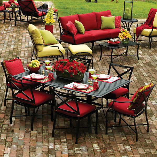
While neutral tones may look nice indoors, outdoors they will blend into the background, so don’t be afraid to use colour. Dark colours in direct sunlight will absorb and retain heat – so although stylish, they may not be practical in very warm climates. It’s easy to update your outdoor room with accent pillows, slipcovers, and umbrellas which are all available in a vast array of colours and patterns. Be sure to select fabrics designed for outdoor use for areas that are exposed to the elements.
ENCLOSURES
To really bring the indoors out, establishing a sense of an enclosure will provide a feeling of purpose to a space. Pergolas are a popular solution, providing filtered sunlight while creating a ‘roof’ to the space. Outdoor draperies can be added for additional mood enhancement and privacy.
LIGHTING
After the sun goes down, good landscape lighting can accent your home and garden...transforming your yard into a magical place while making the space safer at night. For a soft, cozy glow use a combination of electric and natural sources for your lighting needs…candles and lanterns are great on tables, and torches can create an island vibe. Small white Christmas lights are fantastic year round when strung throughout surrounding shrubbery and trees.
GLOBAL DECOR - CARIBBEAN
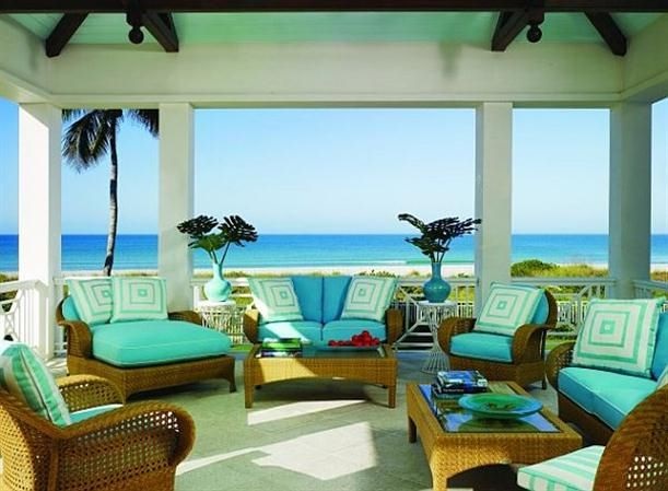
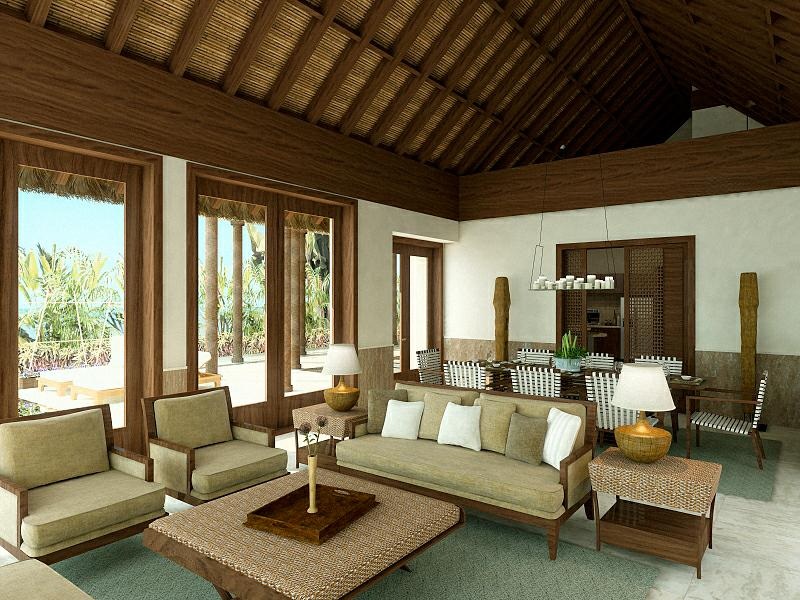
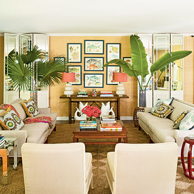
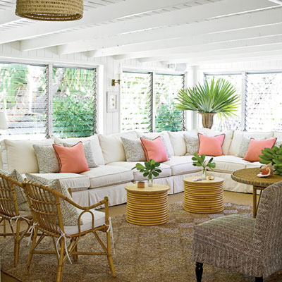
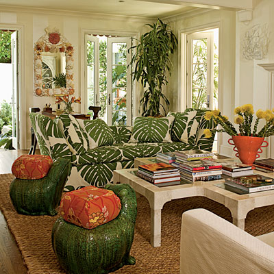
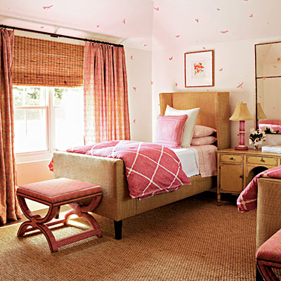
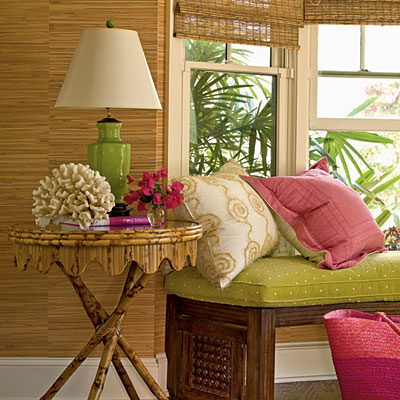
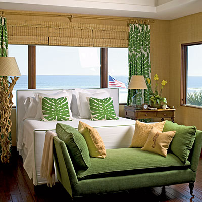
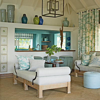
Versatile yet simple furnishings are essential for island décor. Classic rattan and retro patterned fabrics can add a hip vibe to beach interiors. Slipcovers made of natural muslin, cotton, or denim fabrics will provide the perfect backdrop against splashes of brightly coloured fabric and accents in motifs associated with the casual and relaxed style of the Caribbean.
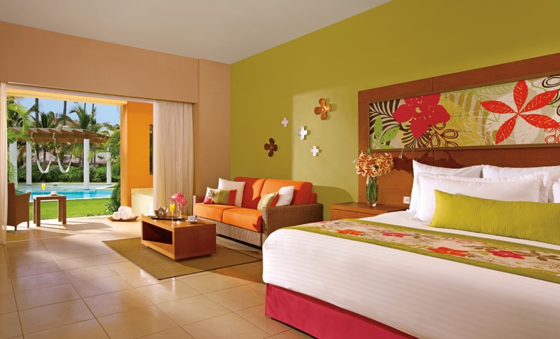
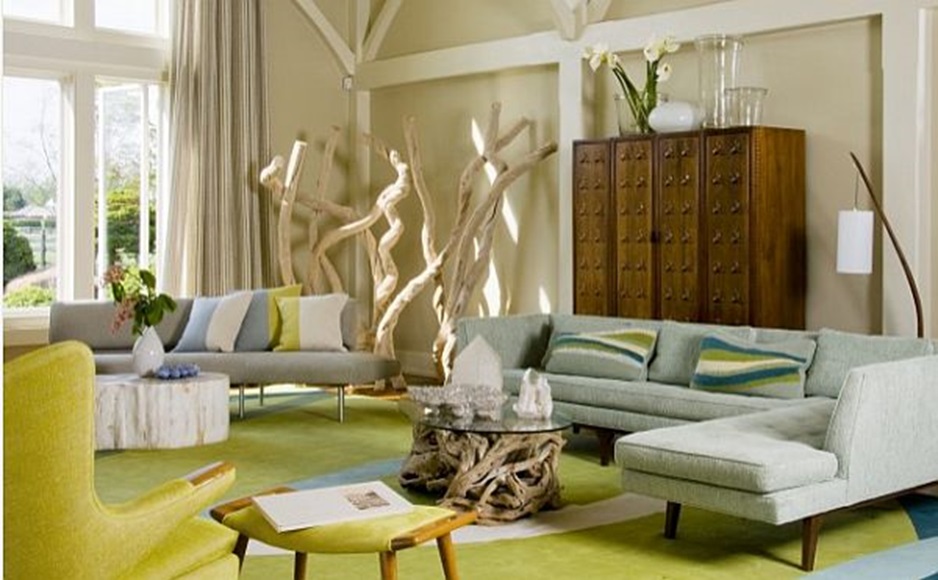
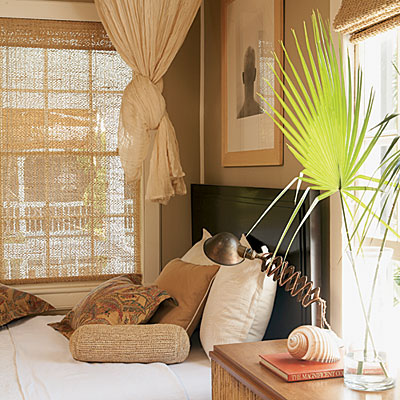
Inspired by nature, colour schemes for simple island elegance can range from ocean blues and palm frond greens, to vivid pink, yellow, and orange for the perfect tropical punch. Contrasting these vibrant hues with natural textural materials such as grass cloth, wicker, rattan, bamboo, teak, woven blinds, shells, and driftwood produces the perfect balance for your space. Successful use of pattern comes with combining them with understated elements for your island inspired rooms.
If your location is a truly tropical one, consider using outdoor fabrics for indoor rooms to keep mold and mildew at bay. These highly durable fabrics can be more costly initially than their indoor counterparts, but their resistance to sunlight and humidity offers substantial savings in the long run, as they will not require frequent replacement.
Caribbean island style has many influences from other cultures – French, Spanish, African, Dutch and English – all blending into a unique rainbow evident in their music, cuisine, and decor. Caribbean natives maintain a laid back approach to life, and infusing this style into your own home will make you feel like you can stay on vacation forever….you can almost feel the warm, balmy breeze and pink sand between your toes and hear the faint rhythmical beat of a calypso drum.
FUTURE PAST - ANCIENT EGYPTIAN STYLE
Although there is a vast difference between the way the peasants and the wealthy furnished their spaces, burial rituals of Pharaohs, Queens, and other wealthy Egyptians have allowed artifacts to be extraordinarily well preserved and studied in museums worldwide.
Most ordinary Egyptian homes were sparsely furnished, and the furnishings they possessed were simple and functional, the most common being a three or four legged low stool. Due to wood being expensive, the lower classes had chests and baskets made of reeds to store their belongings. Tables were not normally used – people squatted on the floor using a wooden board to write on. Meal preparation was also done on the floor, and those who did not use the low stools sat on the ground atop reed mats and pillows. Beds were mattresses constructed of straw, wool, and reed mats.
It was a far different story for the nobility whose homes contained high quality pieces crafted by artisans. Although the stools were still utilized, they were much nicer with seats of animal skins, woven leather strips, or plant materials – some were painted and carved as well. This early culture even invented the folding stool, an example of which was found in the tomb of Tutankhamen.
Elaborate carvings with inlays of gold and ivory on other seating pieces were common amongst the royal families. Tables were used by the upper echelon for dining, gaming, and shrines. Storage chests used by the rich were very ornate – embellished with paintings or inlays depicting scenes.
Using stylized art forms from this civilization, artisans created magnificent paintings, wall murals, sculptures, and pottery –often depicting beliefs and offering a glimpse into the life that existed during this time in history.
Designers today still reference the styles used in Ancient Egypt, as their advanced culture continues to mesmerize even now.
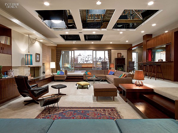
MAD MEN'S GROOVY SET DESIGN
Like a time capsule from the 60’s, the award-winning set of the hit television series ‘Mad Men’ showcases some heavenly mid-century iconic furniture and design motifs.
Sit back with your cigarette and martini, and enjoy a peek of the set’s still photos of an era gone by. From the Draper’s penthouse on Park Avenue, to the offices of Sterling Cooper & Partners, to Megan’s West Coast bungalow, the set designers and decorators don’t miss a detail.
Check out our STYLE FILE: PARK AVENUE PENTHOUSE for products with that strictly uptown Manhattan vibe.
Source: Interior Design magazine
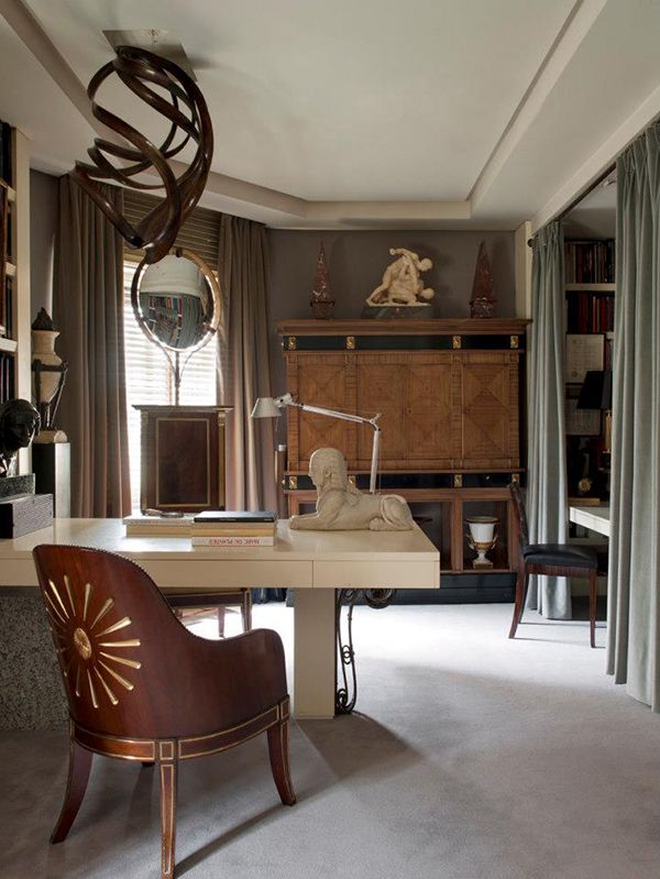
Photography by Eric Laignel
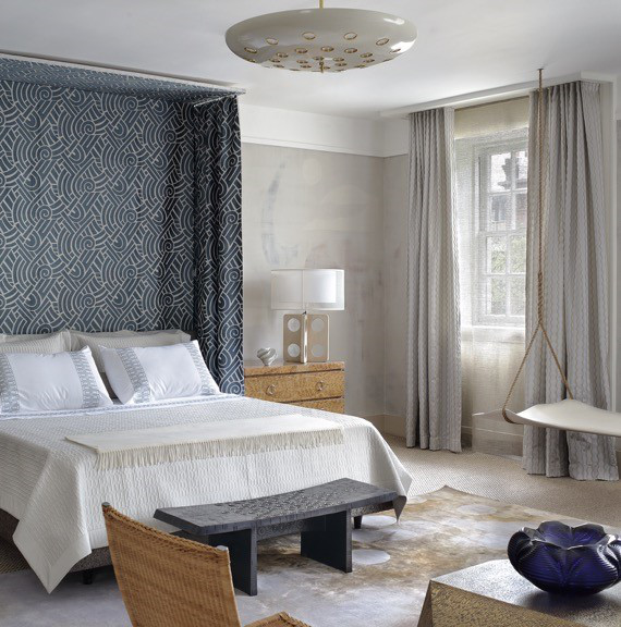
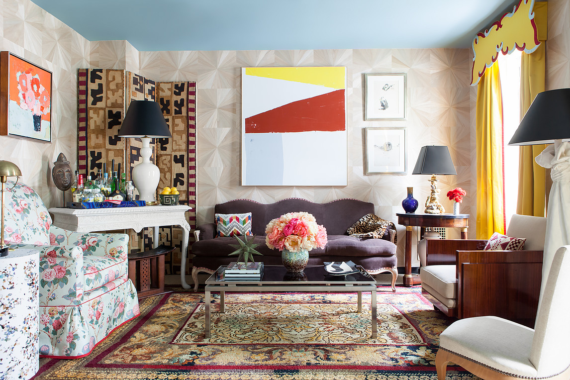
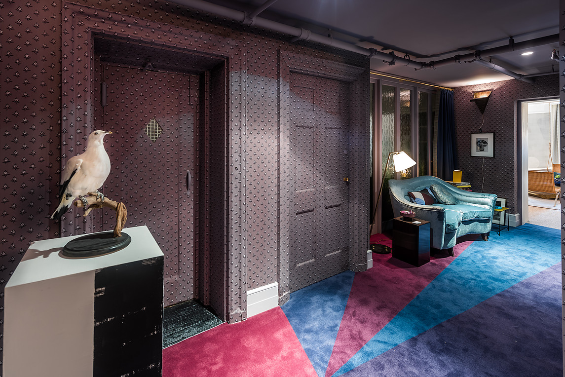
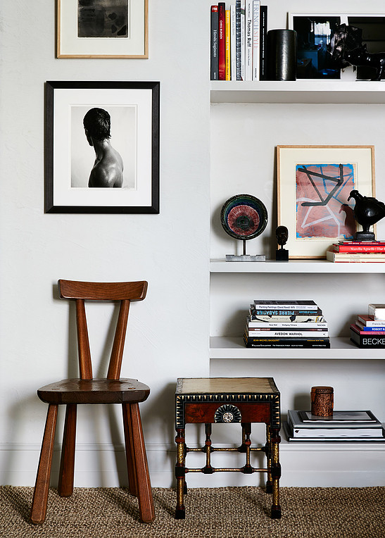
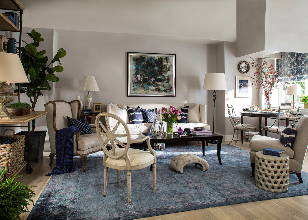
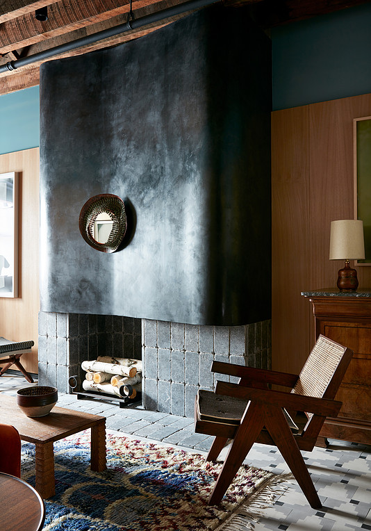
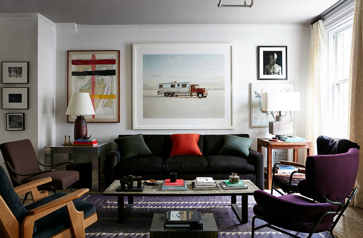
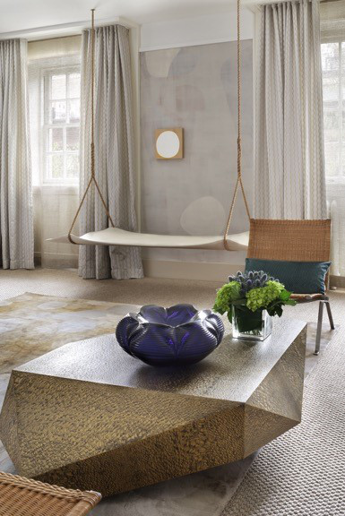
Images from the 2014 Kips Bay Decorator Show House
Just released images from the 2014 Kips Bay Decorator Show House. All photography is by Will Femia.
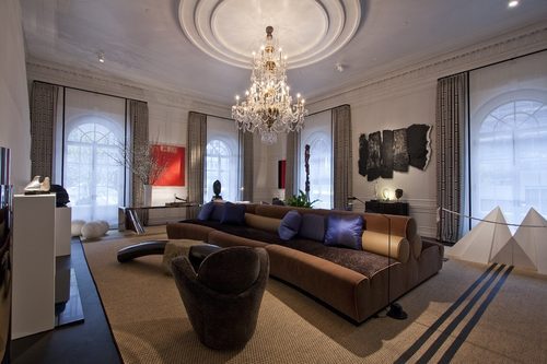
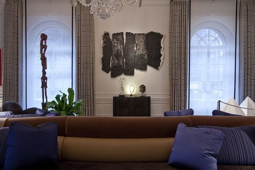
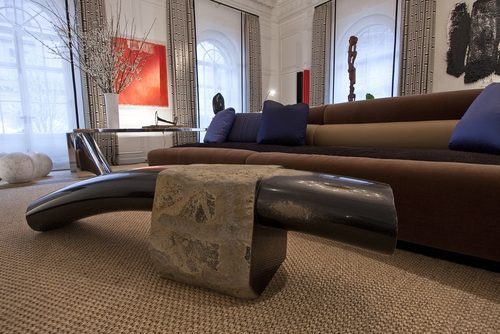
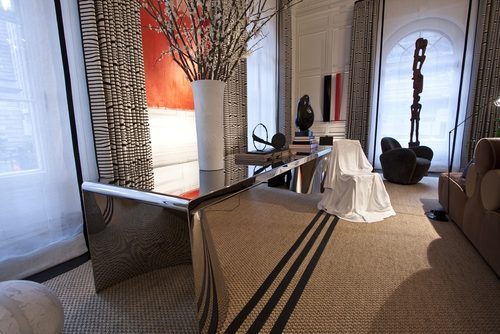
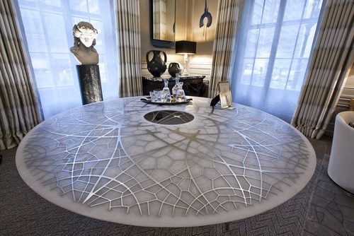
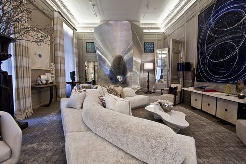
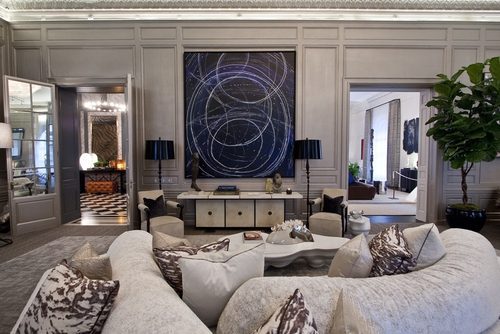
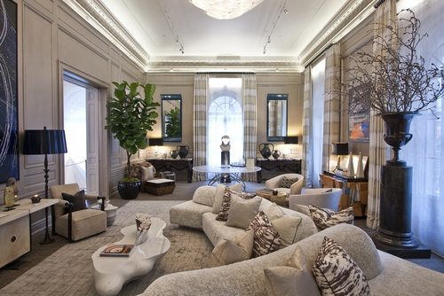
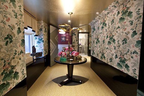
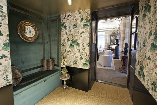
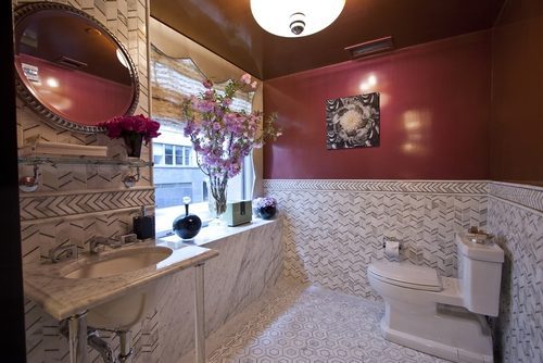
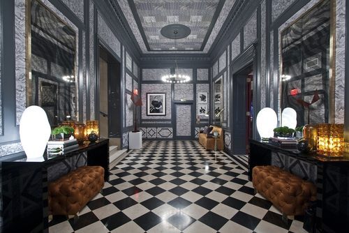
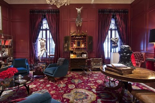
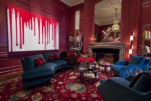
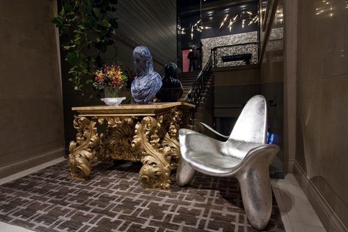
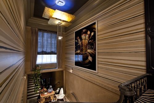
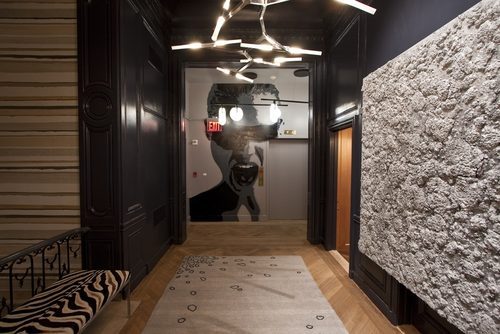
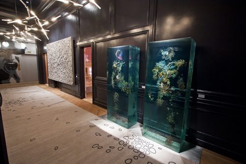
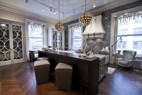
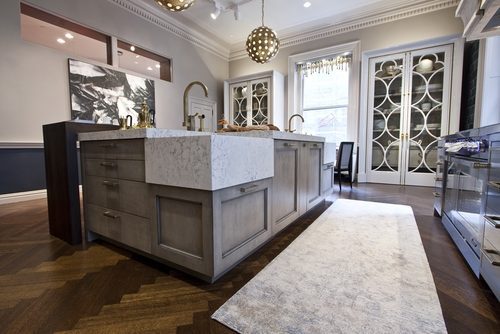
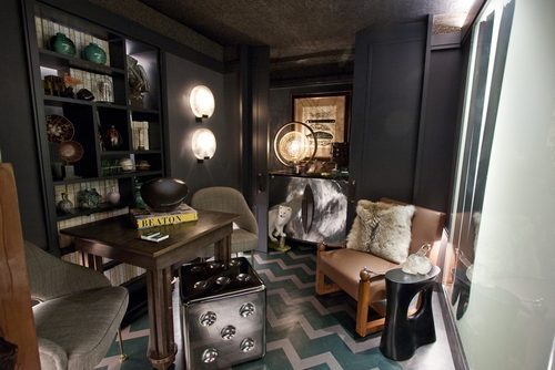
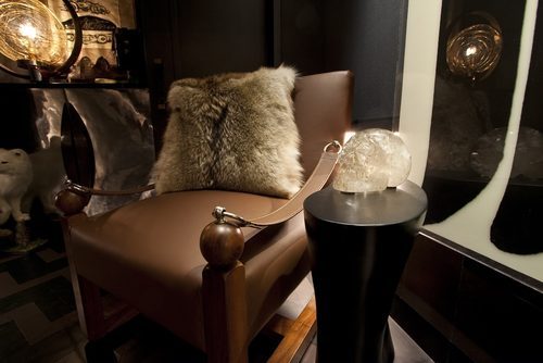
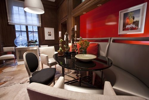
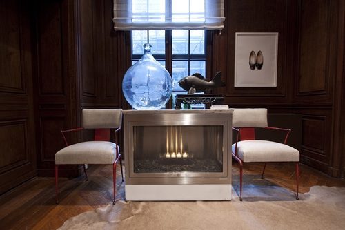
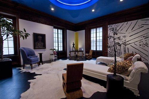
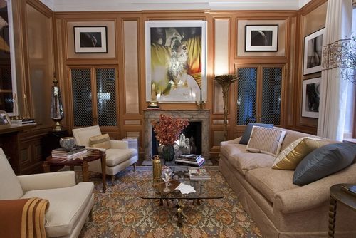
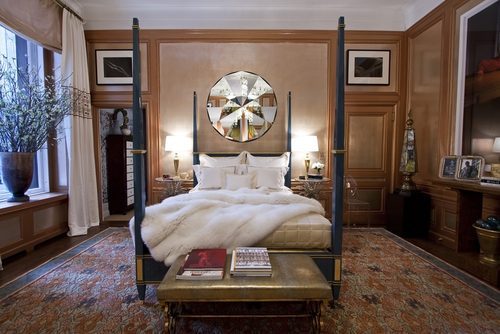
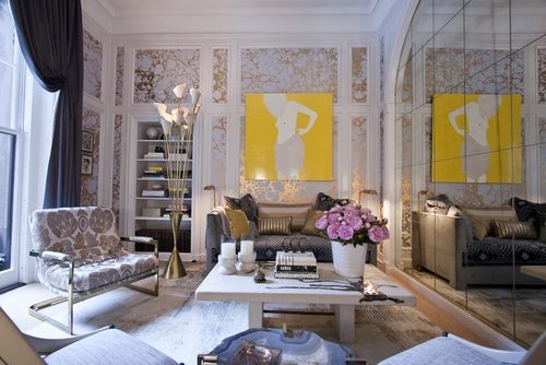
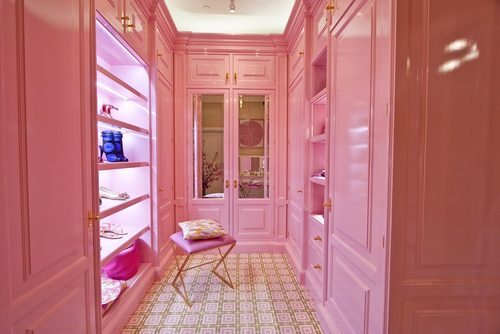
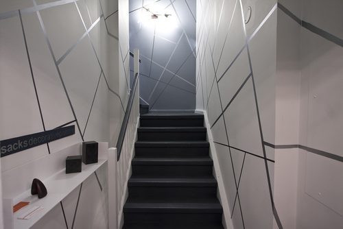
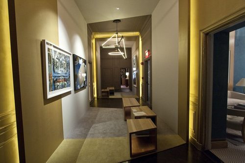
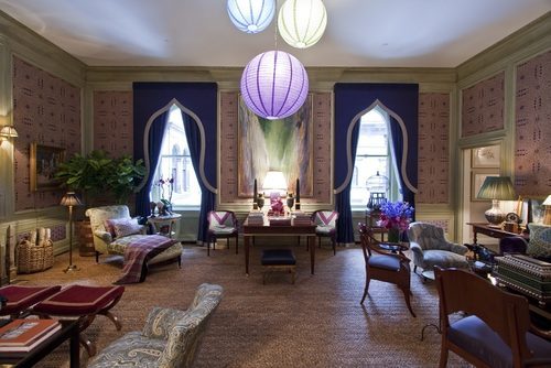
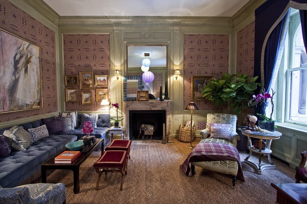
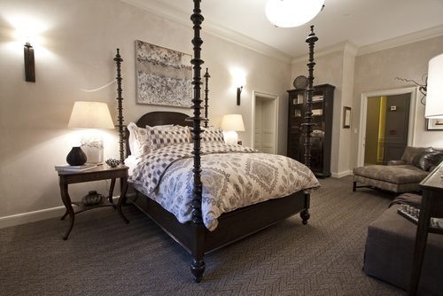
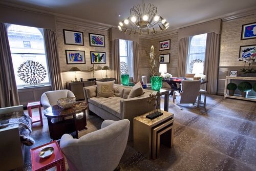
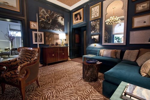
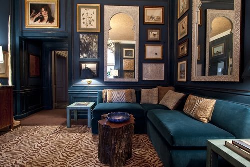
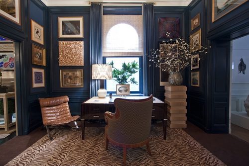
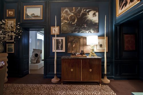
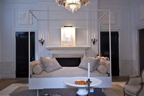
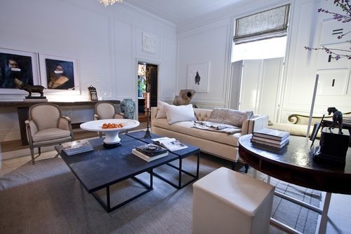
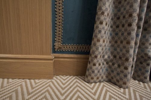
KIPS BAY BOYS AND GIRLS CLUB DECORATOR SHOW HOUSE 2014
The mother of all show houses is now open in New York…the 42nd Annual Kips Bay Decorator Show House 2014. This year top designers have transformed and revived The Villard Mansion on Madison. Adjacent via a grand courtyard to the luxury hotel The New York Palace, this gilded-era mansion is situated in the most luxurious shopping district in the heart of Manhattan.
An icon of old New York, the building was designed and constructed in 1884 on the Southeast corner of 51st Street and Madison Avenue, and renovated in 2011. Architectural details within the six-story and 26,190 square- foot space include a grand staircase, 16-foot high ceilings, several Italian marble fireplaces, marble floored hallways, and a carved panel room with barrel-vaulted ceilings.
Proceeds from the Decorator Show House benefit the Kips Bay Boys and Girls Club which helps more than 11,000 youth ages 6-18 in ten locations throughout the Bronx with after-school and enrichment programs.
Open May 1 through May 29 – it’s sure to be a must see event if you are in, near, or visiting the New York area. It’s a worthy cause, and a wealth of beauty to behold and ideas be inspired by.


